The name
The programme is Next Great American Base. Write it in full every time it appears in public. In running text it is title case; on a card, a title or a lockup it is set in capitals and tracked wide.
It replaces TAPROOT, the working name of the first concept. TAPROOT stays only as the name of the motif: the core and its branches of light.
Write it
- Next Great American Base
- NEXT GREAT AMERICAN BASE on cards, titles and lockups
Never
- The NGAB NGAB is a file name, never a public name
- Next-Great American Base, Next Great America Base
- TAPROOT retired as a programme name
The mark
One upward arrowhead that reads three ways at once: a mountain, an aircraft and a base. The horizon cuts it at the nose. Above the line is what anyone can see; below it are the floors, set in the rock.
- Nose
- The lightest tone, solid, the only part above ground.
- Floors
- Two levels below the horizon, each a step darker with depth.
- Ridge
- The trailing edge, a W with one tooth each side: the line of the hills, and a wing's trailing edge.
- Shaft
- A gap down the centre of the floors. It starts below the ground, so the nose stays whole. In motion, the core's gold light runs down it.
- Horizon
- Two tapered lines broken at the flanks of the mountain. They are the land, and they belong to the mark.
Lockups
Use the horizontal lockup by default, the stacked lockup when the space is closer to square, and the icon where the name already appears nearby or there is no room for it. Each comes for dark grounds, light grounds and in one colour. Use the files; never rebuild a lockup by hand.
Clear space and minimum size
Keep a clear margin around every lockup equal to the height of the nose, measured from its tip to the horizon. Nothing else goes inside it: no text, no edge of the frame, no other logo.
- Horizontal lockup
- At least 160 px wide on screen, 40 mm in print.
- Stacked lockup
- At least 96 px wide on screen, 24 mm in print.
- Icon
- At least 20 px on screen, 6 mm in print. Below that, use the mono icon.
Misuse
Colour
The mark is cool and monochrome, lightest at the nose and darker with depth. Gold is the core's light. It appears as light only, a line, a glow, a seam, and never fills a shape of the mark. Select a swatch to copy its value.
Night, for dark grounds
Day, for light grounds
Light and ground
Type
One family, Archivo, used at its widest. The expanded cut gives the name the width of a runway and keeps short cards calm. It is open source (SIL Open Font License), so it ships with every file.
NEXT GREAT AMERICAN BASE
Archivo Expanded Medium name, cards, headings
Capitals, tracking 0.26 em for the name and 0.30 em for cards.
BUILT FOR THE NEXT CENTURY
Archivo Expanded Light sub-lines and taglines
Capitals, tracking 0.50 em, set at about 40 per cent of the name's size.
The installation of the next century begins with its own energy at the core, and everything else grows out from it.
Archivo Light and Regular reading text
Normal width, sentence case, 16 to 18 px on screen, line height 1.6.
It begins with energy
Try the width axis
Taglines
Built for the next century.
The primary line. It closes every film and sits under the name in the stacked title.
Campaign lines
Each line carries one of the programme's commitments. Use one per frame, slide or section. Cards are capitals with no full stop; in text, sentence case with one.
- It begins with energyFoundation first: its own power at the core, then everything else.
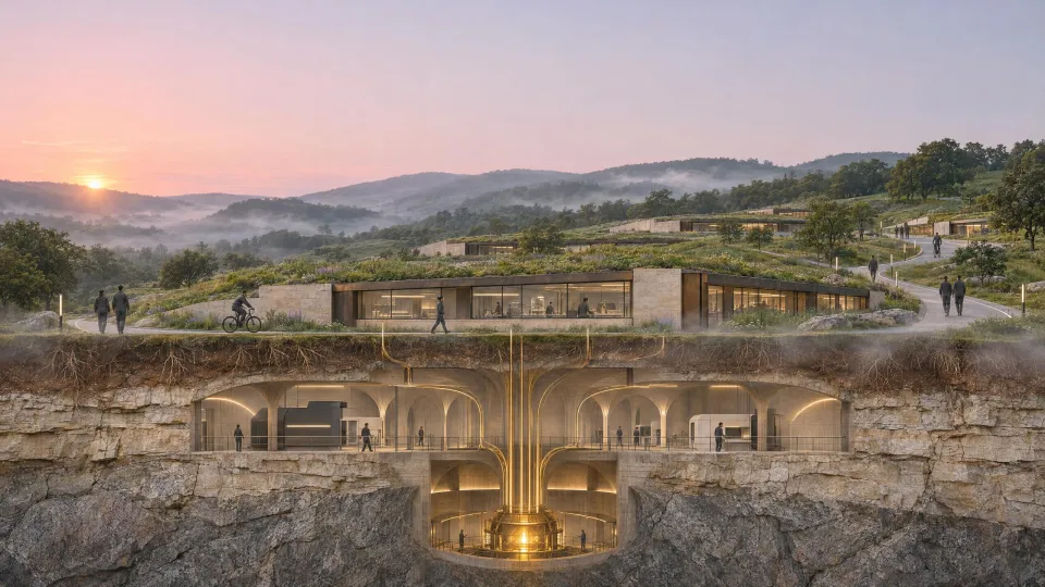
- Power · Compute · DataThe acreage below the surface.
- 90 days · Off every gridNinety days running on what the base makes itself.
- Defended in every domainLand, air, space and the network.
- Machines carry the routineRobots and driverless vehicles do the repetitive work.
- People keep the decisionA person makes every call that matters.
- A home for those who defend itThe surface is a good place to live.
- Built for the next centuryThe century-scale commitment.
Alternate lines for review
Proposed, not yet approved: candidates for a second line under the name, or for a social cut.
- Power first. Everything grows from it.
- Rooted in energy. Ready for anything.
- The base that keeps its own lights on.
Voice and rules
Veiled, not explained
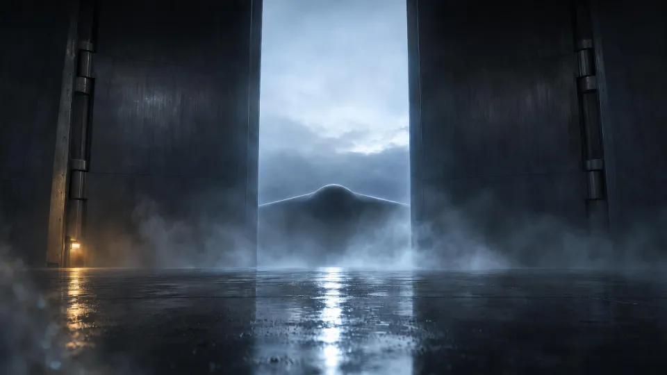
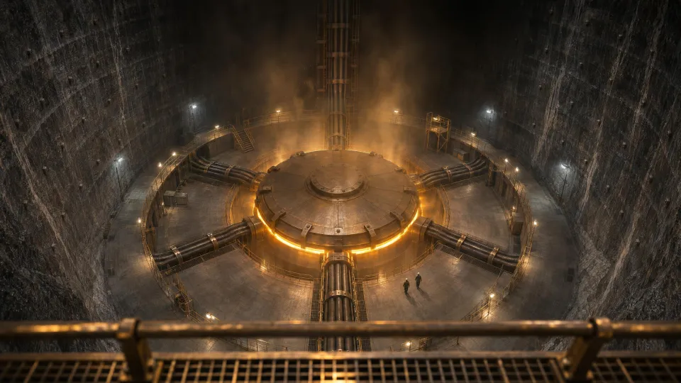
Show an edge, a seam of light, a silhouette. Never a whole aircraft, a whole building or a floor plan.
Inland, anywhere
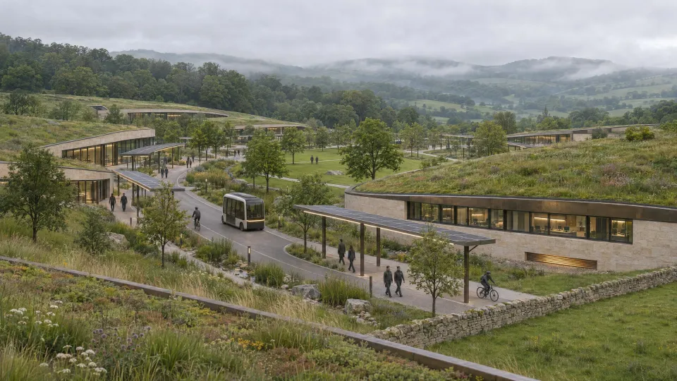
No ocean and no coastline. High desert, rolling forest, old mine country: any state must see itself in it.
Lighter above, power below
The surface is green, low and calm. The core is deep, dark and glowing.
Real, near-future technology
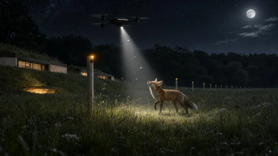
Humanoid robots, driverless vehicles, drones, reactors, compute halls. Nothing alien.
No narration
Films carry no voiceover. Words appear on short cards; the score carries the rest.
Calm and confident
Write plainly and specifically. No hype words, no threats, no fortress talk.
Imagery
One warm gold light, the core's light, appears somewhere in every frame: a seam, a conduit, a glow under a door, a line on a machine. People are mid-task, in profile or from behind, never posing for the camera. Every picture is photoreal, with deep blacks and a restrained teal and amber grade.

Motion
- Cards
- A gold scan line passes across the line and each letter resolves as it is crossed. A hairline rule draws under it. On screen for 2 to 3.5 seconds.
- The title
- The horizon draws outward from the centre, the nose rises up through it, the floors build downward, then the name and the primary line resolve beneath. The title holds; it never scans out.
- The shaft
- On the last beat, gold light drops down the shaft into the ground. This is the one place the mark carries gold.
- Pace
- Slow in, firm stop. Easing settles (cubic out); nothing bounces, except the nose's last few pixels as it clears the horizon.
Download the kit
Every lockup as SVG and PNG, for dark, light and one-colour use, and both Archivo Expanded cuts with their licence.